Pulse Report
As you know, your success on the Nearby Now platform is contingent upon the interaction of you and your team interaction. With high-quality and consistent interaction, our customers see great results. Think of the new Pulse report as your success heart-beat. It’s an outlook of your health over the last two weeks, designed to give you a quick understanding of how your team has been doing and hopefully make it immediately obvious if anything needs to change.
The report is broken down into three sections:
User Check-ins
The User Check-ins bar graph shows your daily velocity. Starting with the oldest date first, through the current day of the week.
Review Requests
The Review Requests bar-graph is a stacked bar-graph showing the number of review requests sent each day and the number of review requests completed. Keep in mind that it’s common for a customer to complete a review several days after you’ve sent a review request, so it’s possible on any given day to have more completed reviews than reviews requests sent (weekends especially).
Top 10 Leaders
The Top 10 Leaders is a heath graph that shows how your top–10 performers are doing compared to the team as a whole. It’s not an indication of how the team is doing overall.
The graph is comprised of two bars. The first bar is the number of review requests sent, and the second typically shorter bar is overlaid on top of the first bar and represents the number of review requests completed. The scale of the bar is based on the user with the highest number of sent and completed reviews for the time-period.
The bars are color coordinated by health. Each segment has a different calculation but the colors represent a similar meaning. Here’s the breakdown:
Green
Sent = Top Sender
Completed = Very High Conversion %
Blue
Sent = Moderate Send Rate
Completed = Average Conversion %
Orange
Sent = Low Send Rate
Completed = Poor Conversion %
Red
In both cases, a red color means the user Needs Immediate Attention. They are either not sending enough review requests, or their conversion rate on review requests is extremely low.
Page Views
Using Nearby Now to check-in, and get customer reviews, ultimately leads to page views for your integrated website. We’ve been tracking all page views generated via our API (WordPress/Joomla plugins, or custom PHP/.NET/RoR apps/sites). Each time our API is called to query for data, we’ve been logging it and categorizing the nature of the request. This is triggered by a page view, which is a person (organic) or a crawler (search engine bot), that is viewing your site that has the Nearby Now plugin installed. Customers with frequent daily page views both organic and crawlers see the most success with Nearby Now.
Starting today, you can now query this page view data in three ways:
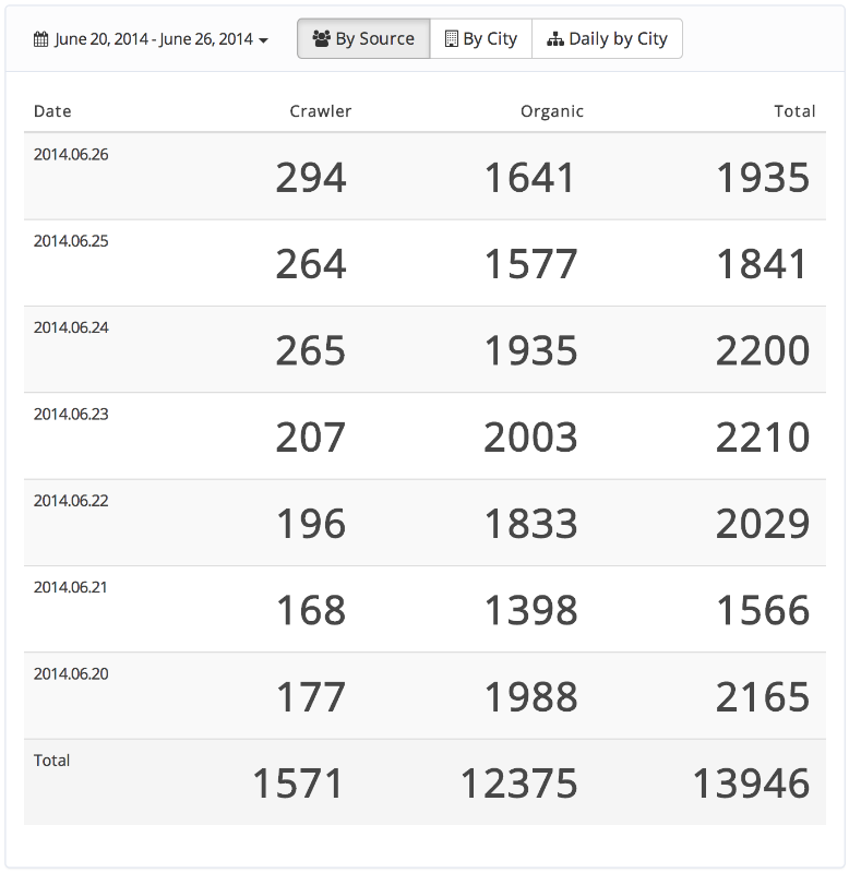
Daily by Source
The source report is a daily breakdown of page views aggregated by source (organic & crawler). This is a great way to see how much Internet traffic your plugin-enabled pages are seeing.
By City
The city report is a page view aggregate by state and city. This is useful to see which of your hyper-local plugin-enabled pages are seeing the most traffic.
Daily by City
Same as the city report, except the aggregate is broken down further by day. This is a great way to see which plugin-enabled pages are seeing the most traffic each day.
Login now to check out the new reports.
Let me know what you think! Your feedback is valuable and it helps us shape the future of Nearby Now.

